What the App Does
The app is not a single leaderboard or a single model. It is a set of connected tools that let you move from a league-wide view down to a single game, single team, single line, or single player.
1. Schedule and game discovery
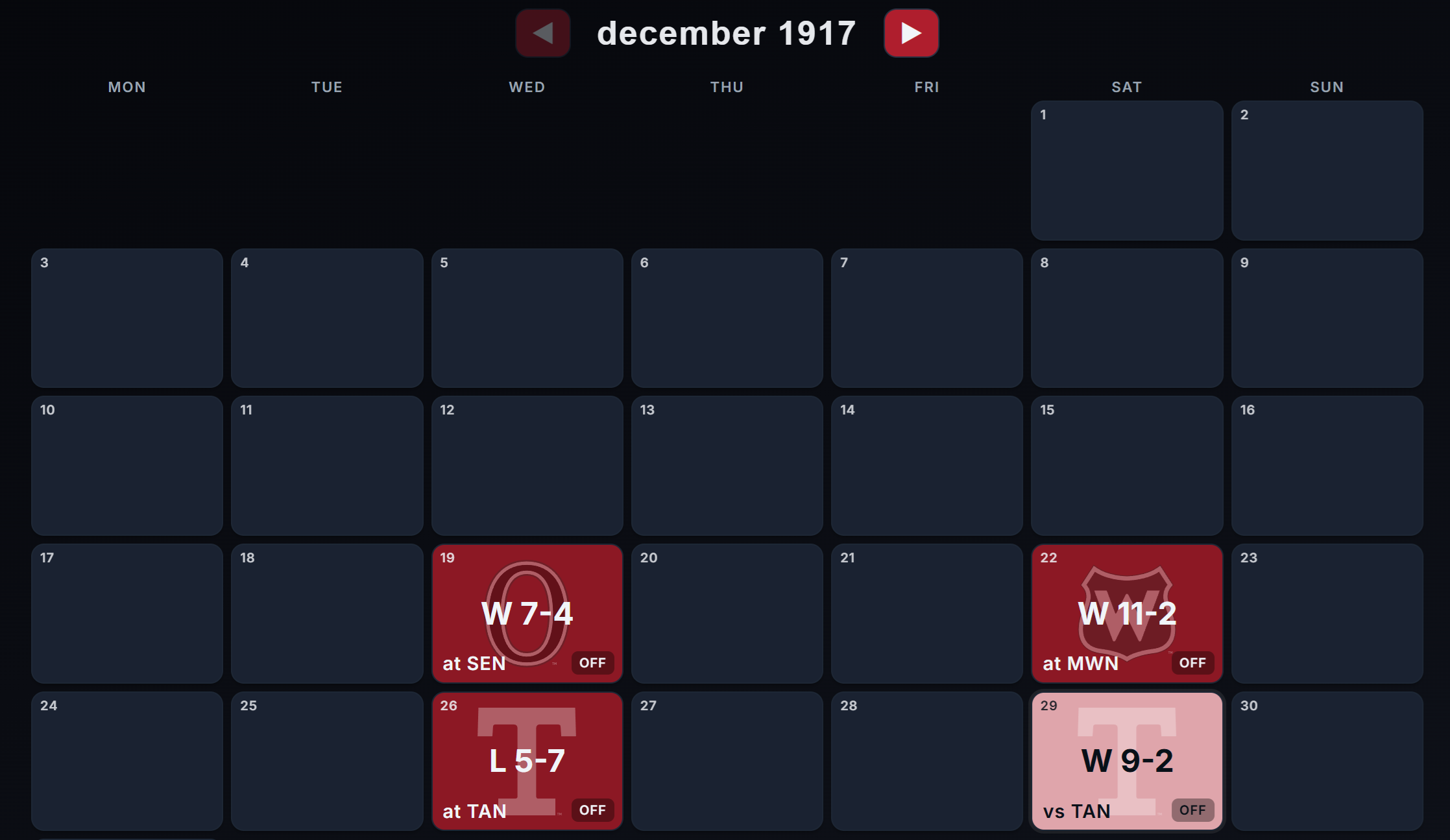
The home page is the front door. It gives you a schedule view that makes it easy to browse the calendar and jump into individual games. Instead of forcing users to start with raw data tables, the app starts with the hockey itself: what games are being played, what happened, and where you want to dig deeper.
This matters because hockey analysis usually starts with context. Before you look at a RAPM chart or an xG split, you need to know which game, team, or player you are trying to understand.
The schedule, standings and games include all games to ever have been played in the NHL - Dating back to the 1917/1918 season.
2. Live Games
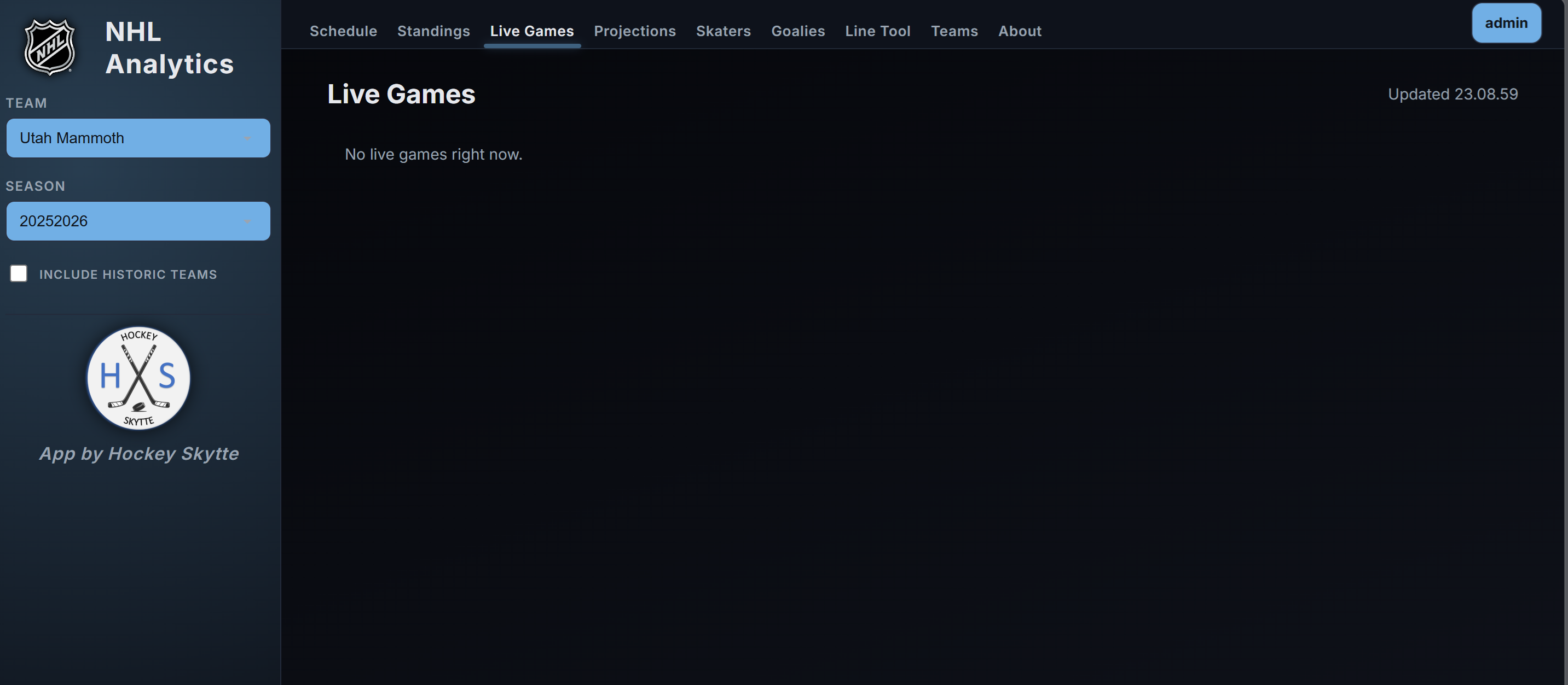
The Live Games page surfaces games in progress in a format that is fast to scan. It is built for active follow-up rather than postgame reading. If you want to see what is happening right now, move directly from the schedule into the live layer and then into the full game page.
For people who follow a slate of games at once, this page acts like a control panel.
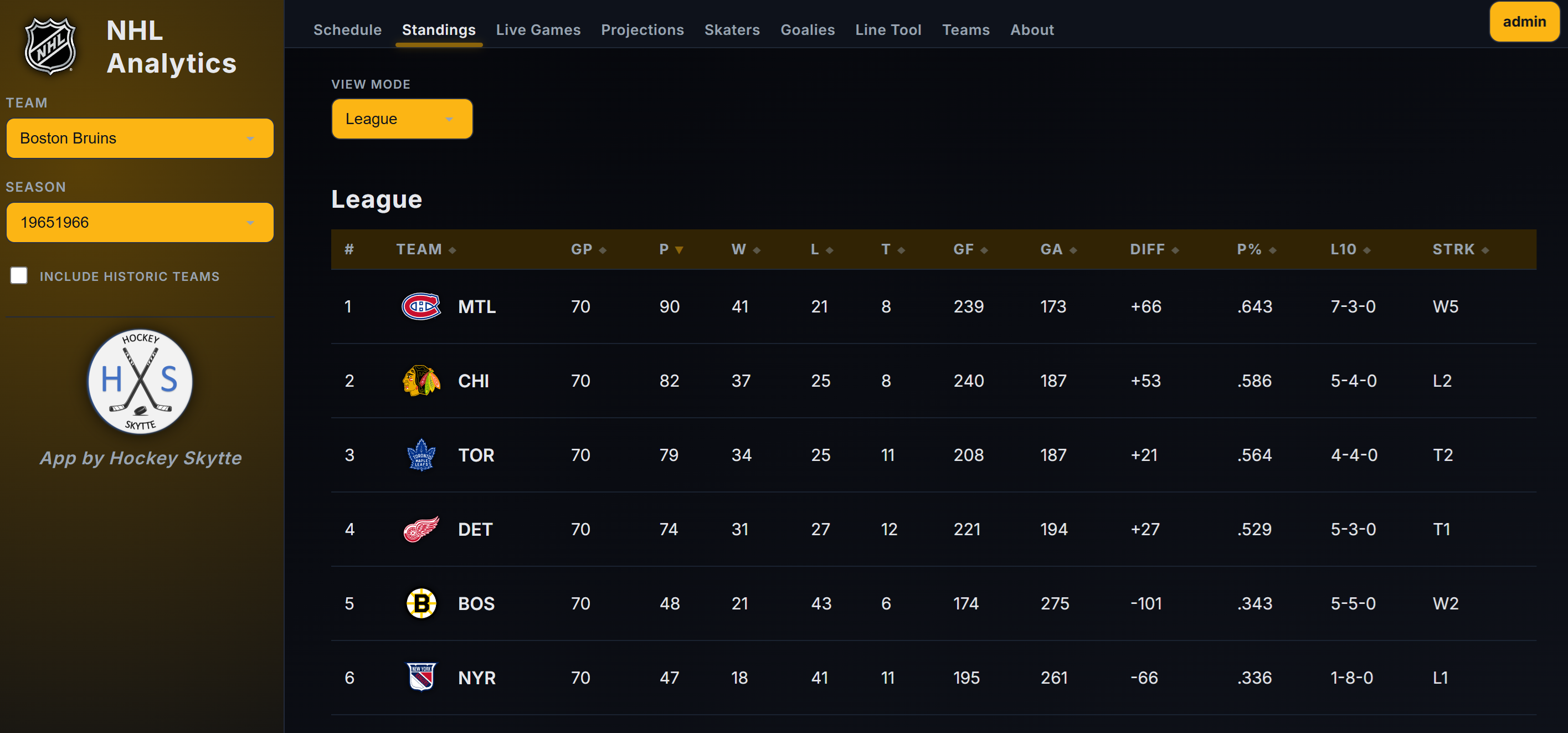
3. Standings
The Standings page gives the seasonal league view. That may sound simple, but standings matter because they are the baseline everyone already understands. The app uses standings as a bridge between familiar hockey language and more advanced analysis.
You can think of standings as the answer to "what happened in the standings table," while the rest of the app increasingly answers "why?"
4. Game pages
The game page is one of the most important parts of the platform. It is where raw game context becomes real analysis.
A game page includes:
- A report view
- Lineups
- Play-by-play
- Shifts
The report view is where a lot of users will spend most of their time. This is where you can move beyond final score and start asking questions about shot quality, territory, pressure, and momentum.
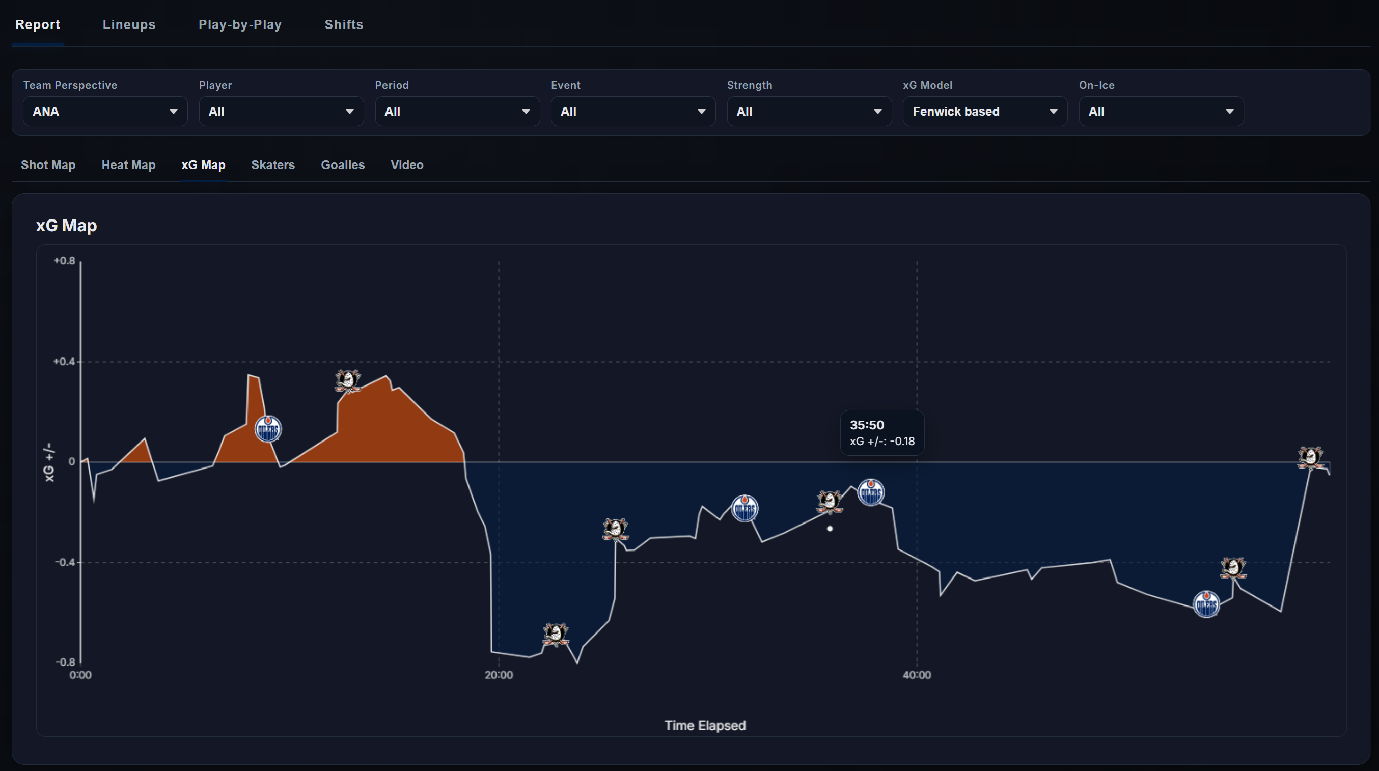
The play-by-play view lets you inspect the event stream directly. The shifts view lets you connect those events to who was actually on the ice. That is a major difference between a stats site and an analytics platform: the app is not just storing outcomes, it is trying to connect outcomes to players, matchups, usage, and context.
You can download raw Play-by-Play and Shift data directly from the game pages.
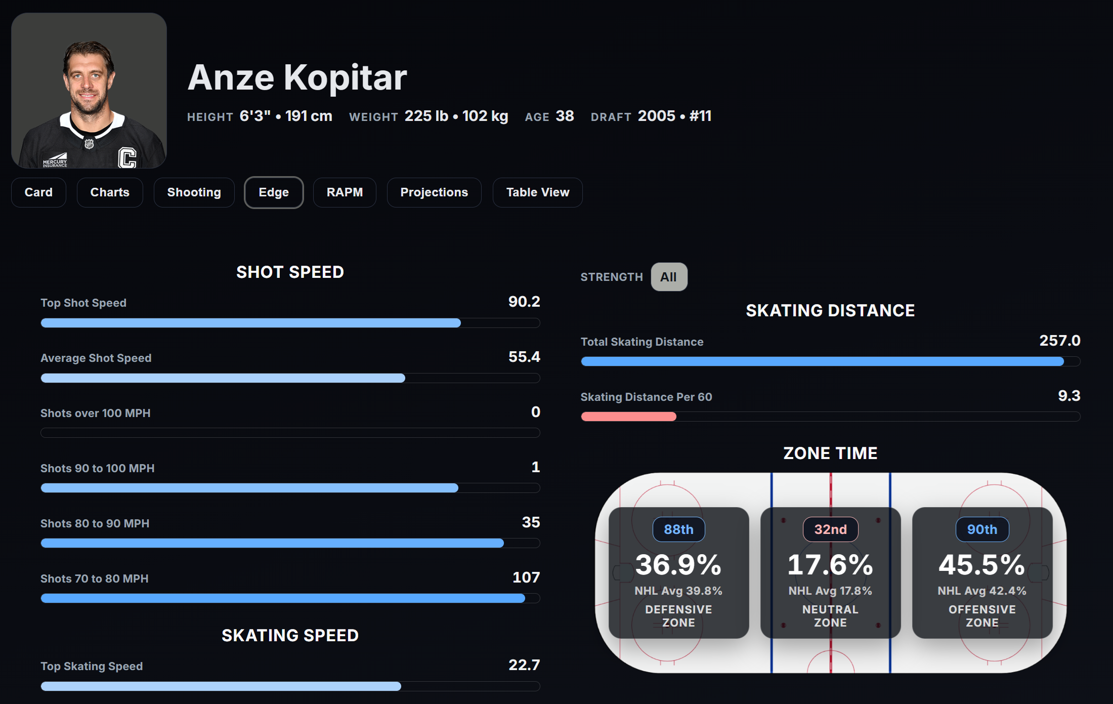
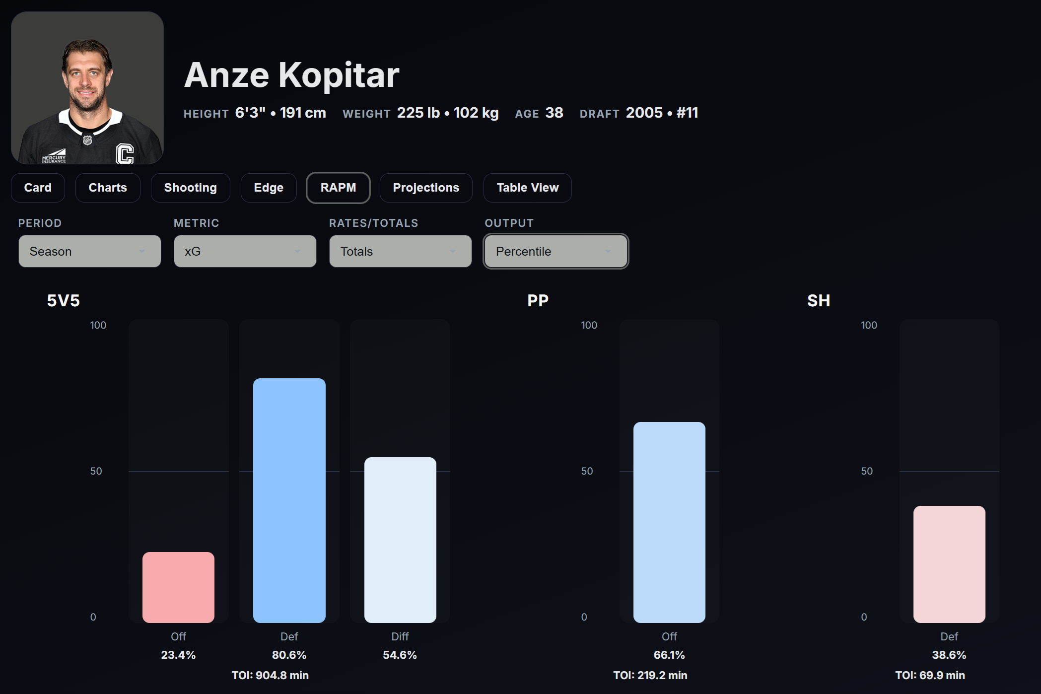
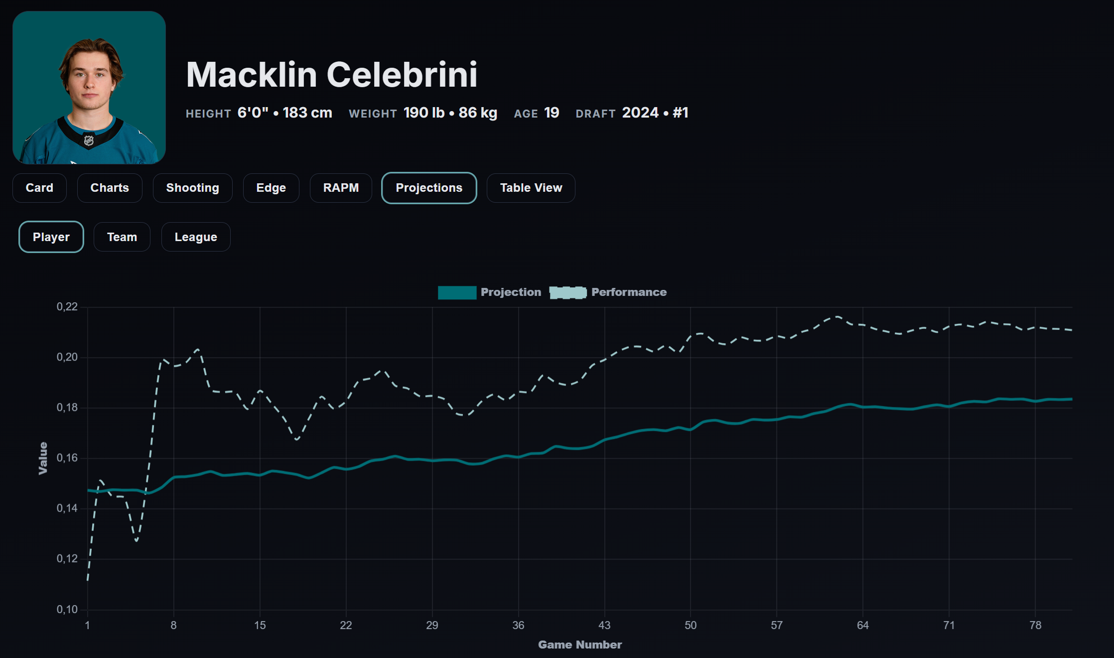
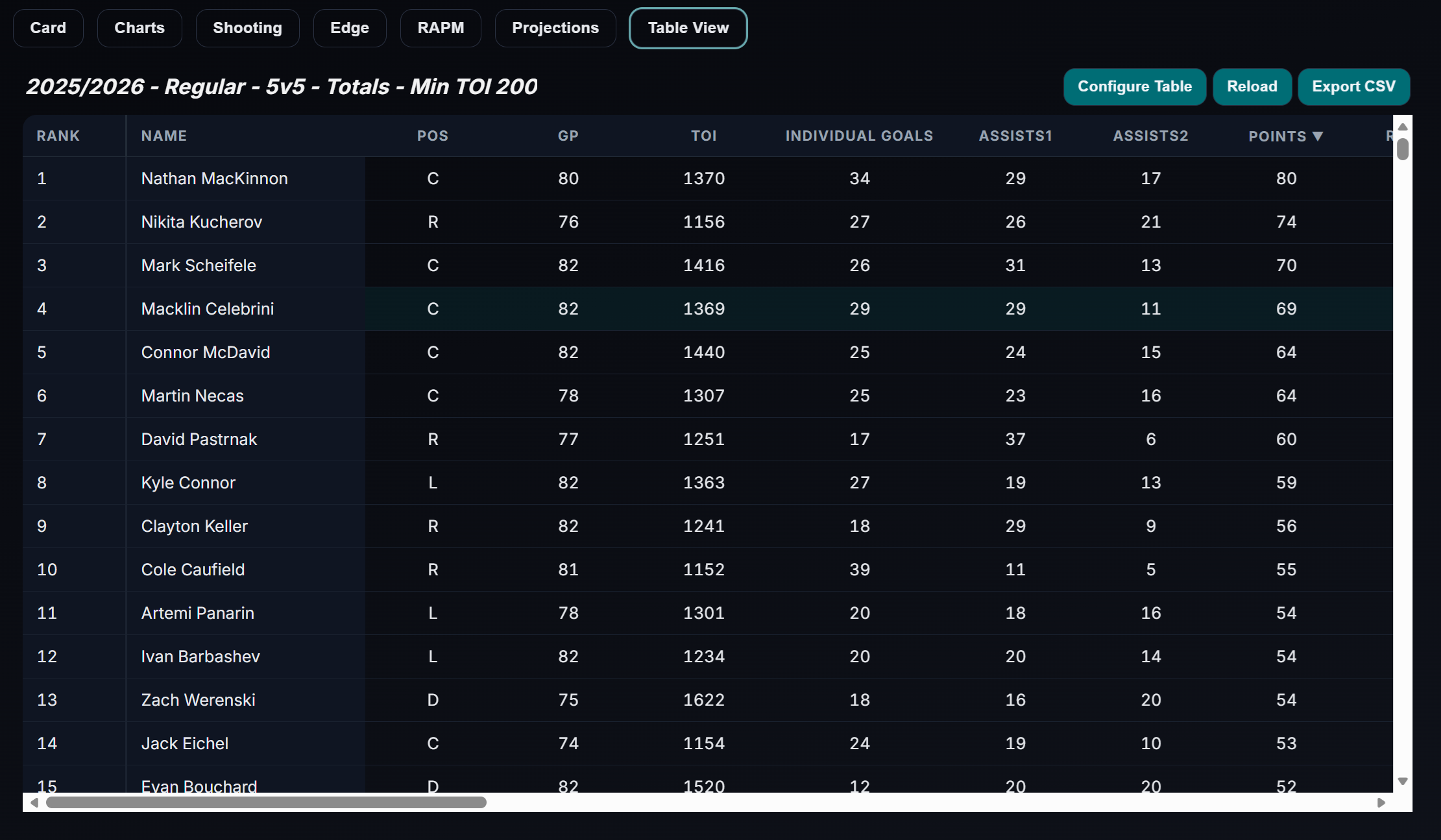
5. Skaters page
The Skaters page is a full player-analysis workspace. It includes:
- Card
- Charts
- Shooting
- Edge
- RAPM
- Projections
- Table View
This is where a user can move from a specific player question to a broader league comparison.
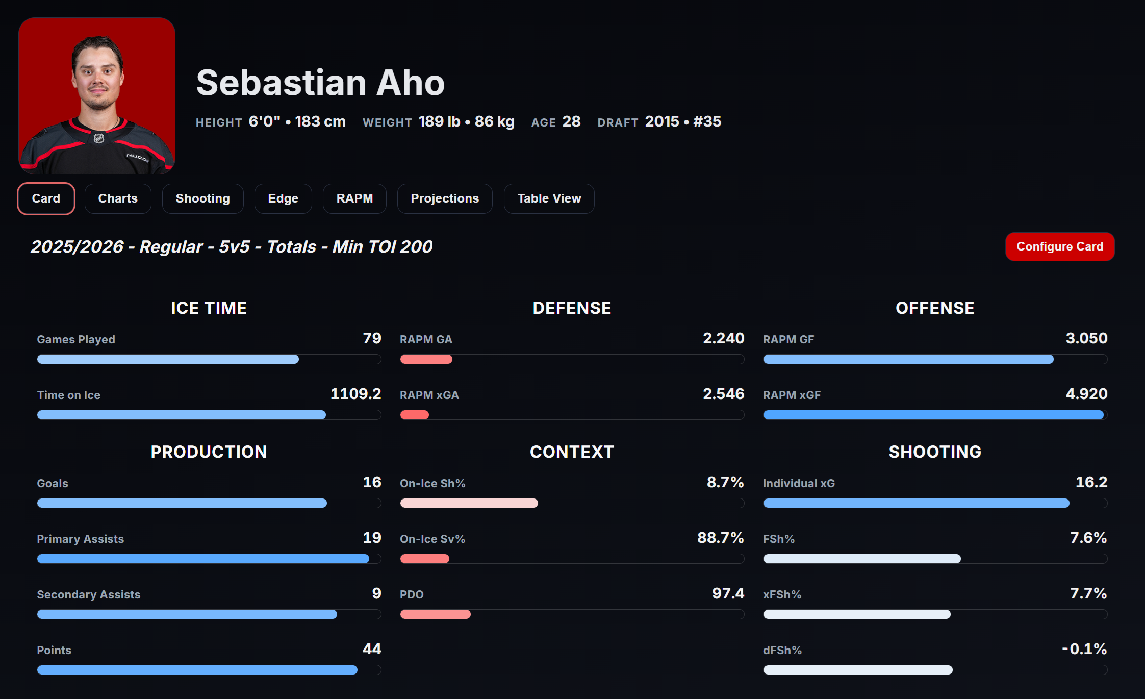
The Card tab gives a fast profile of the player. You can customize exactly what metrics you prefer the Card to show. The bar size and color indicate the percentile ranking.
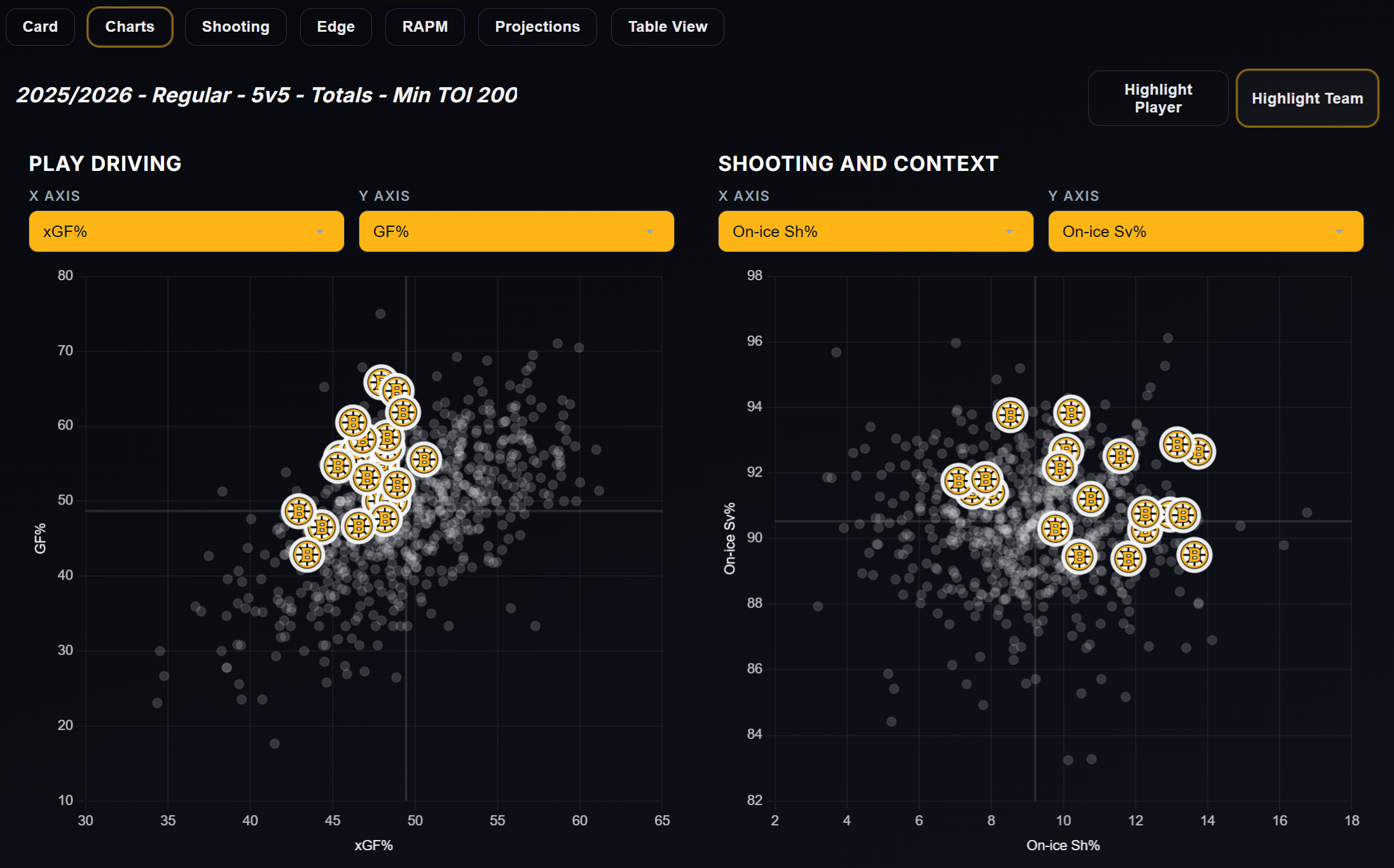
The Charts tab is for comparison and positioning. You can choose what metrics you want to compare.
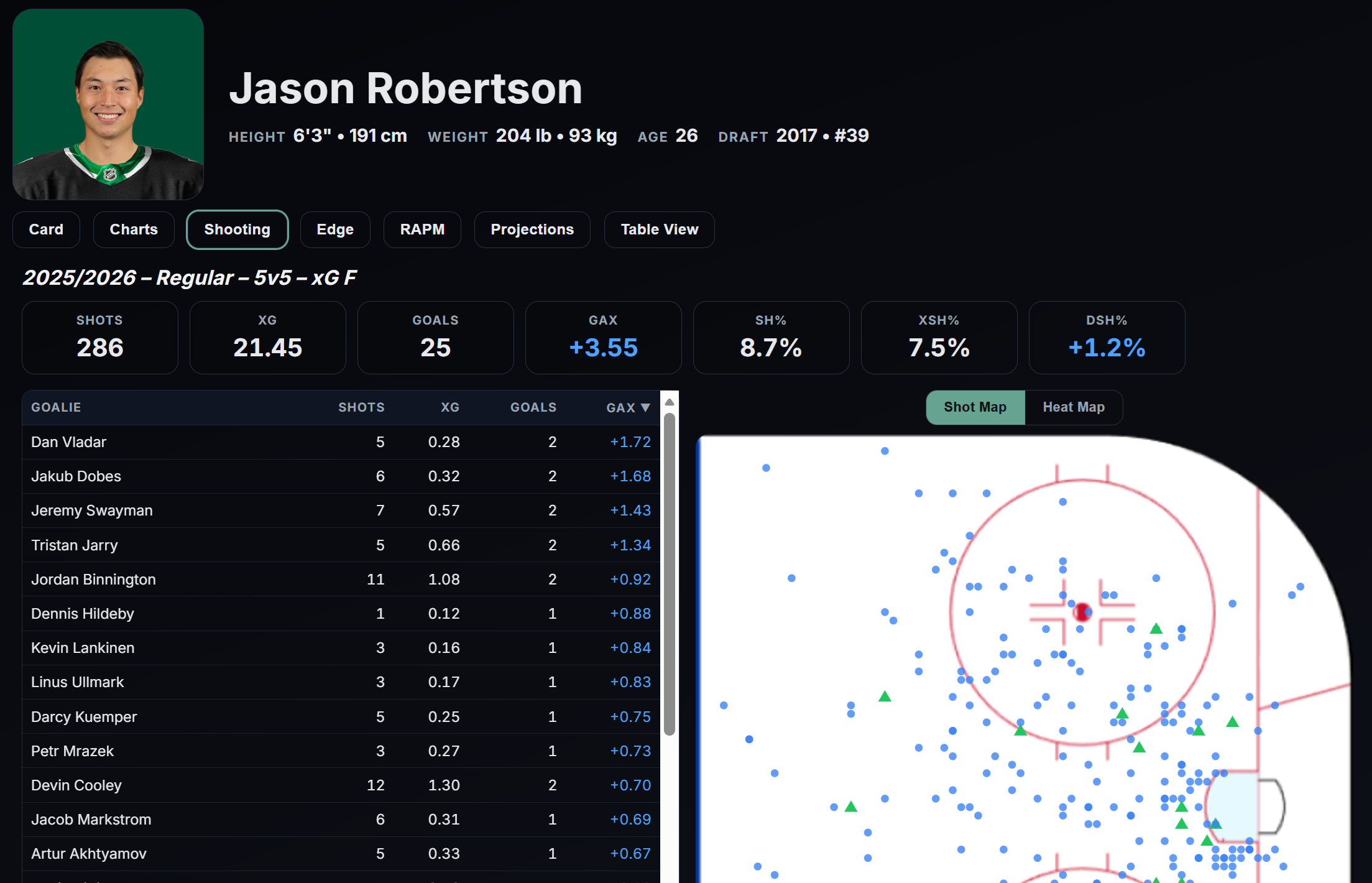
The Shooting tab helps explain finishing, shot patterns, and chance generation. You can filter the shots versus a specific goaltender, by clicking in the Goalie table. Likewise, you can filter the data by shot location using the Heat Map. The video button shows goals by the selected player.
The Edge tab gives another layer of visual and context-driven interpretation. It loads the NHL EDGE data directly from the NHL Api.
The RAPM tab isolates player impact more directly. You can read more about the RAPM models below. You can choose between different metrics and different outputs.
The Projections tab provides forward-looking context. It shows the player projections used for the game projection model.
The Table View lets you zoom out and compare one player against a larger peer group. You can configure the table view as you like, and all table views are downloadable.
If you care about player evaluation, this is one of the app's deepest surfaces.
6. Goalies page
Goalies have their own dedicated space because skater logic and goalie logic should not be treated as the same problem.
The Goalies page includes:
- Card
- Charts
- Goaltending
- Table View
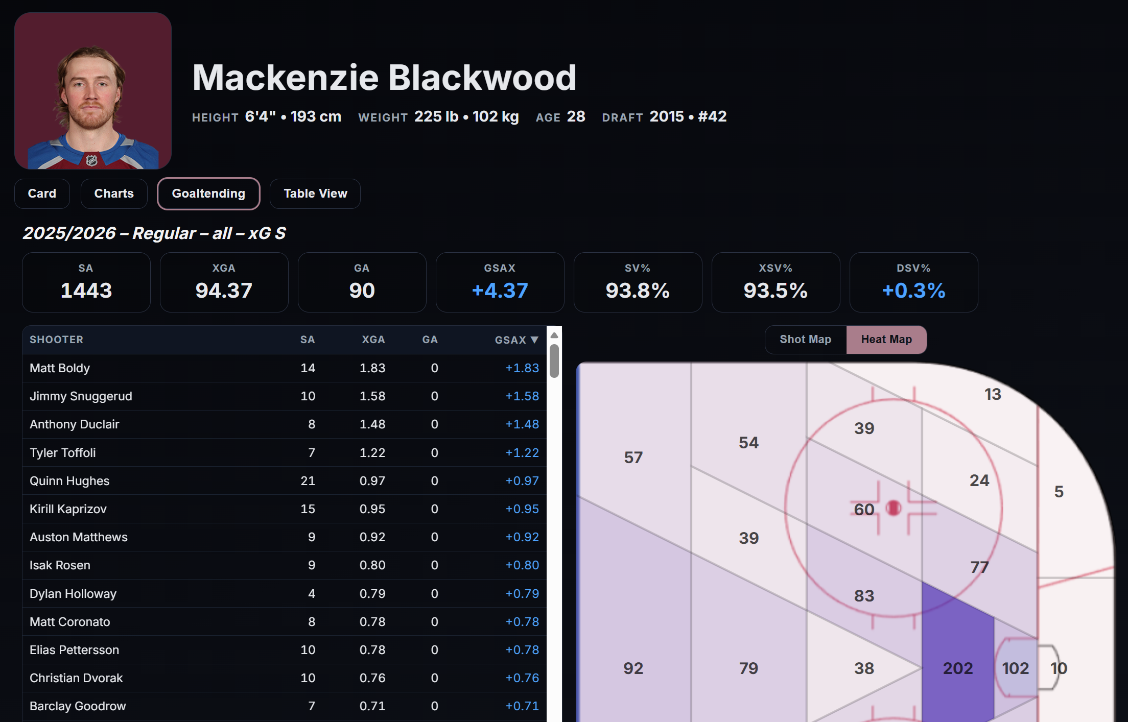
Goaltending is unusually noisy and unusually dependent on environment, workload, shot quality, and game state. A dedicated goalie page helps separate those questions cleanly instead of forcing goalie analysis into skater frameworks that do not fit.
7. Teams page
The Teams page shifts the lens from player-level evaluation to team identity and team performance.
It includes:
- Card
- Charts
- Edge
- Projections
- Table View
This is where you can ask questions like:
- Is this team winning through shot volume or shot quality?
- Are they controlling play territorially?
- Are they overperforming their underlying numbers?
- How do they compare to the rest of the league?
- Where are their strengths and weaknesses coming from?
For many users, the Teams page will be the easiest gateway into analytics because team-level patterns are often easier to see before moving into player isolation.
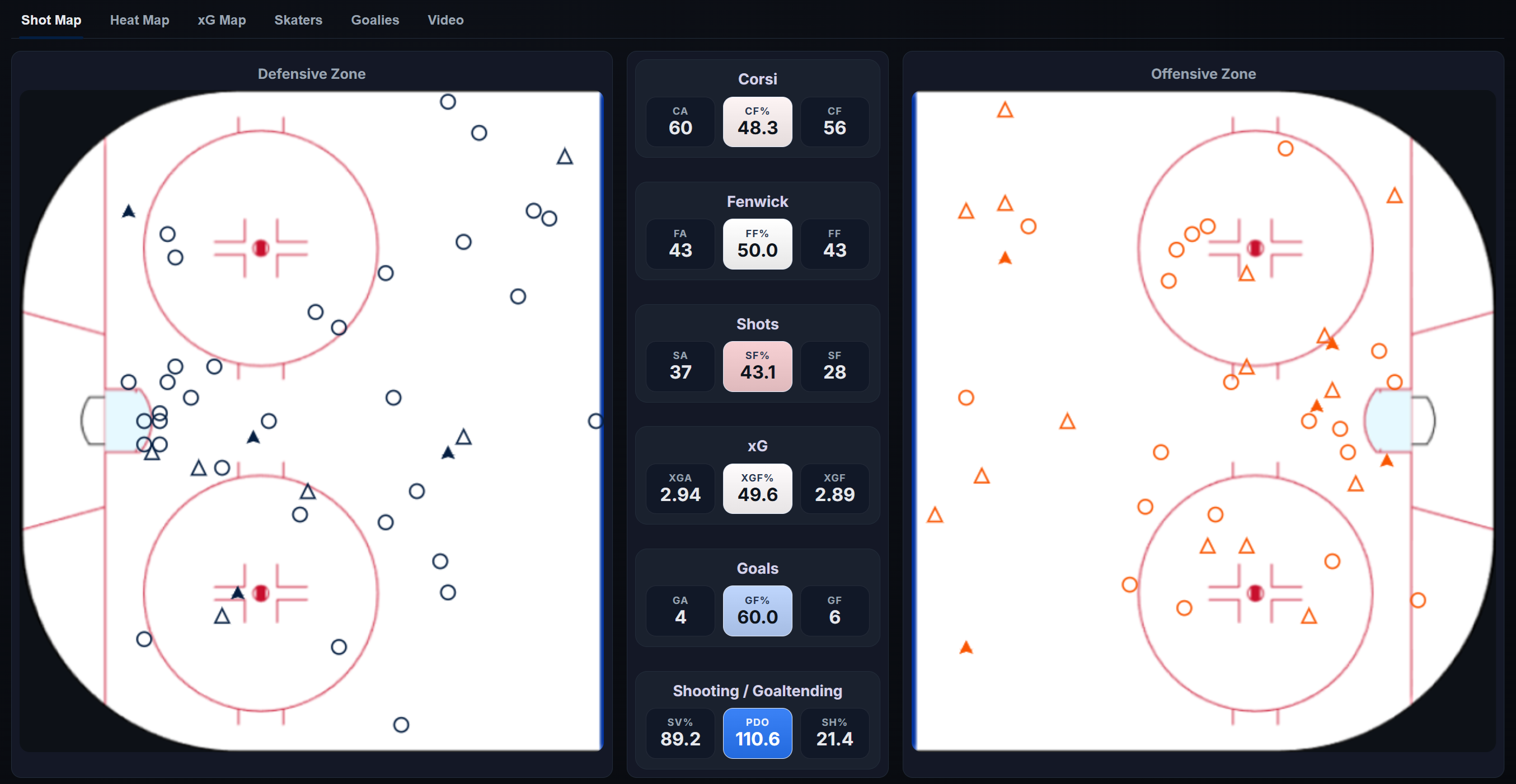
8. Line Tool
The Line Tool is one of the most distinctive parts of the app.
It includes:
- A Heat Map view
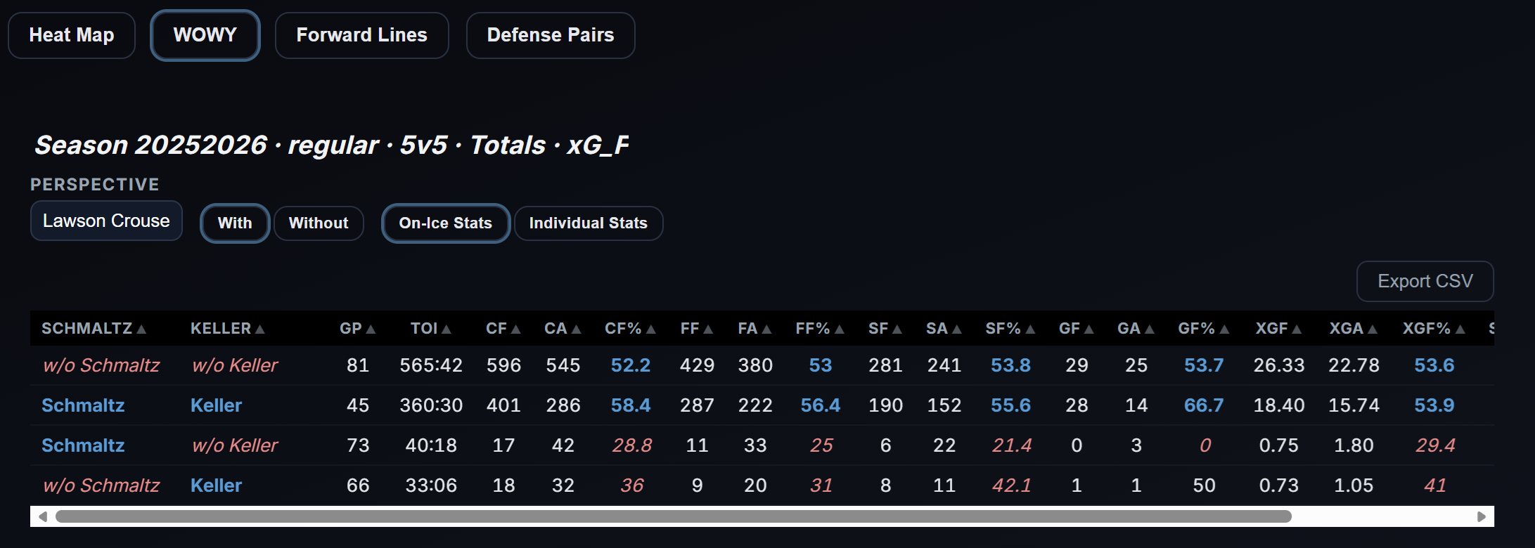
- WOWY analysis
- Video integration
- Line, pair, and player selection
- KPI panels and zone-based filtering
You can choose up to 5 players, but you can also just pick just one player to see his On-Ice statistics. You can also include a goaltender, to see if a player performs better in front of one goalie over the other. The Video button will show the goals with selected players on the ice together - Both for and against.
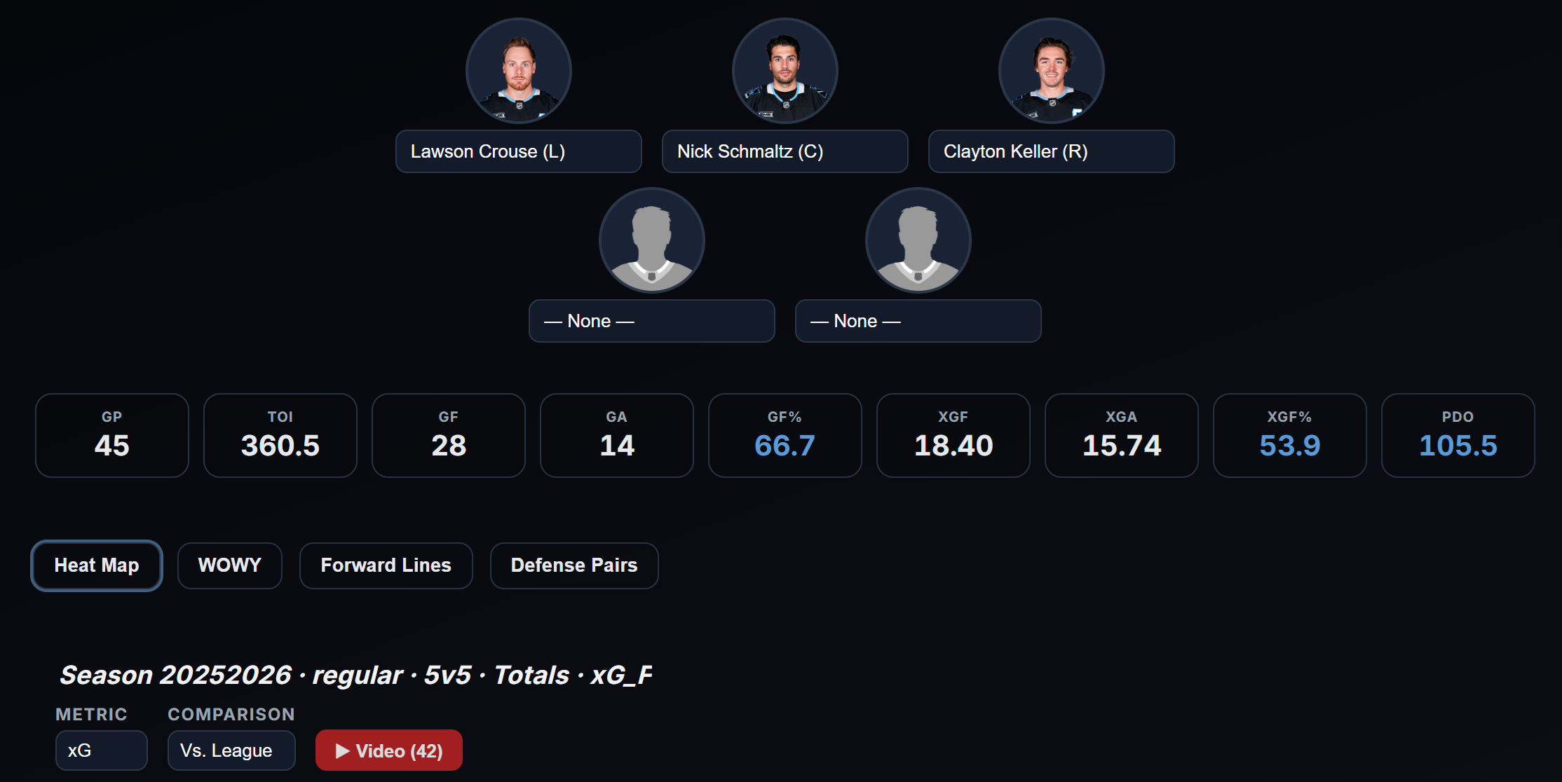
In the heat map you can compare the performance to the team or the league. If the color is blue, it means that the selected players are performing better than the team average or league average. So, in the defensive zone blue means fewer shots and in the offensive zone blue means more shots.
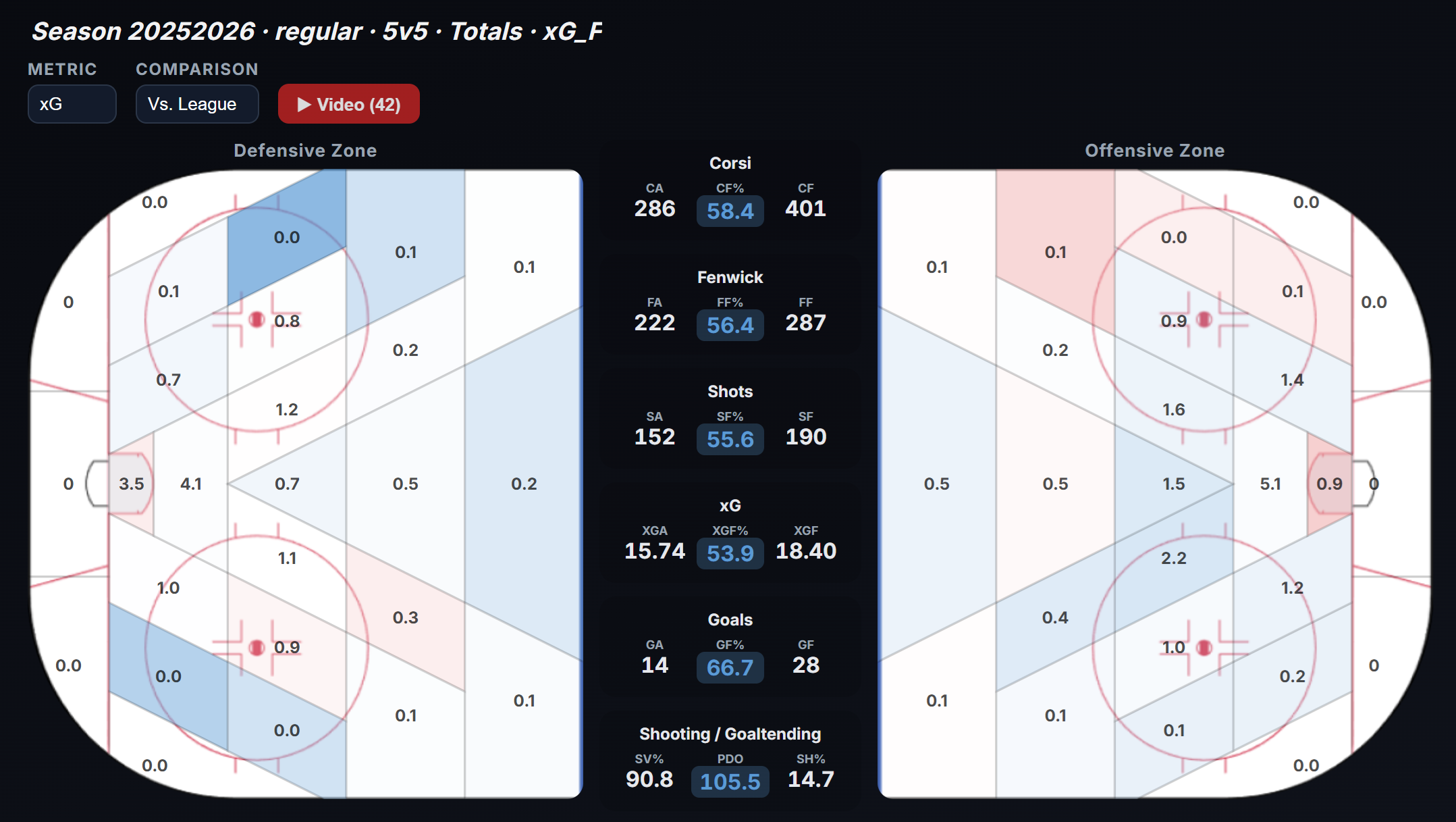
This is the kind of tool that turns data from static information into something you can actively test.
You can use it to explore how combinations of players perform together, where they create or allow chances, and how results change depending on teammates. The WOWY view is especially useful when you want to ask whether a line's results are truly driven by the group or whether one player is carrying the outcome.
On the WOWY page you can see the results with and without the selected players. It's setup so you see the data from the perspective of a particular player. You can of course change the perspective.
This kind of lineup analysis is one of the hardest things to do well in hockey, and it is one of the places where the app becomes more than a dashboard.
9. Odds page
The app also includes odds tracking and odds history. That gives users another lens on games: not only what the model says, but how the market has moved. The odds data is from DraftKings via the NHL Api and it only gets updated from 12PM ET.
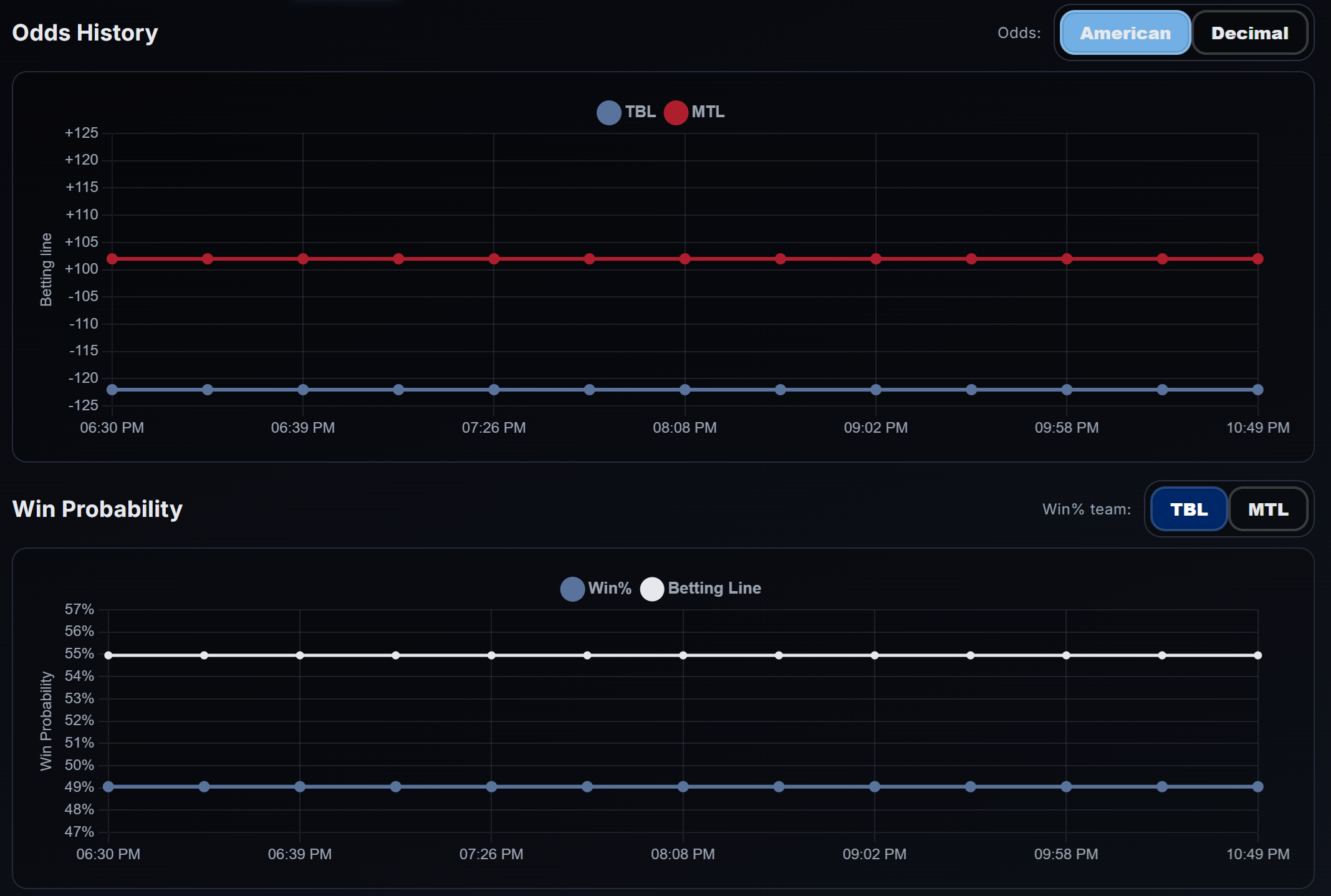
That does not mean the app is only for betting. It means the platform understands that betting markets are one of the most useful real-world signals in hockey. Odds movement can reflect lineup news, goalie confirmations, injury updates, and market sentiment. When combined with the rest of the app, odds history becomes context rather than noise.
10. Projections page
The Projections page includes:
- Games
- Series
- Bracket
- Stanley Cup Probability
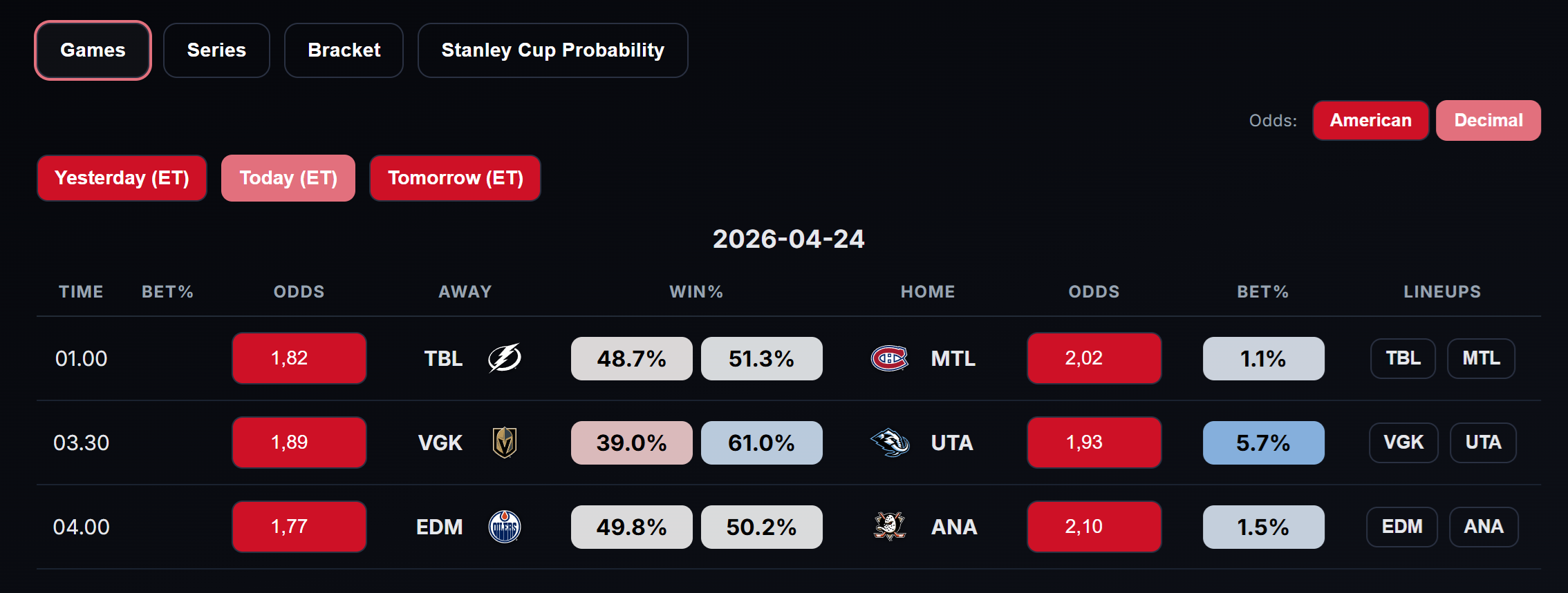
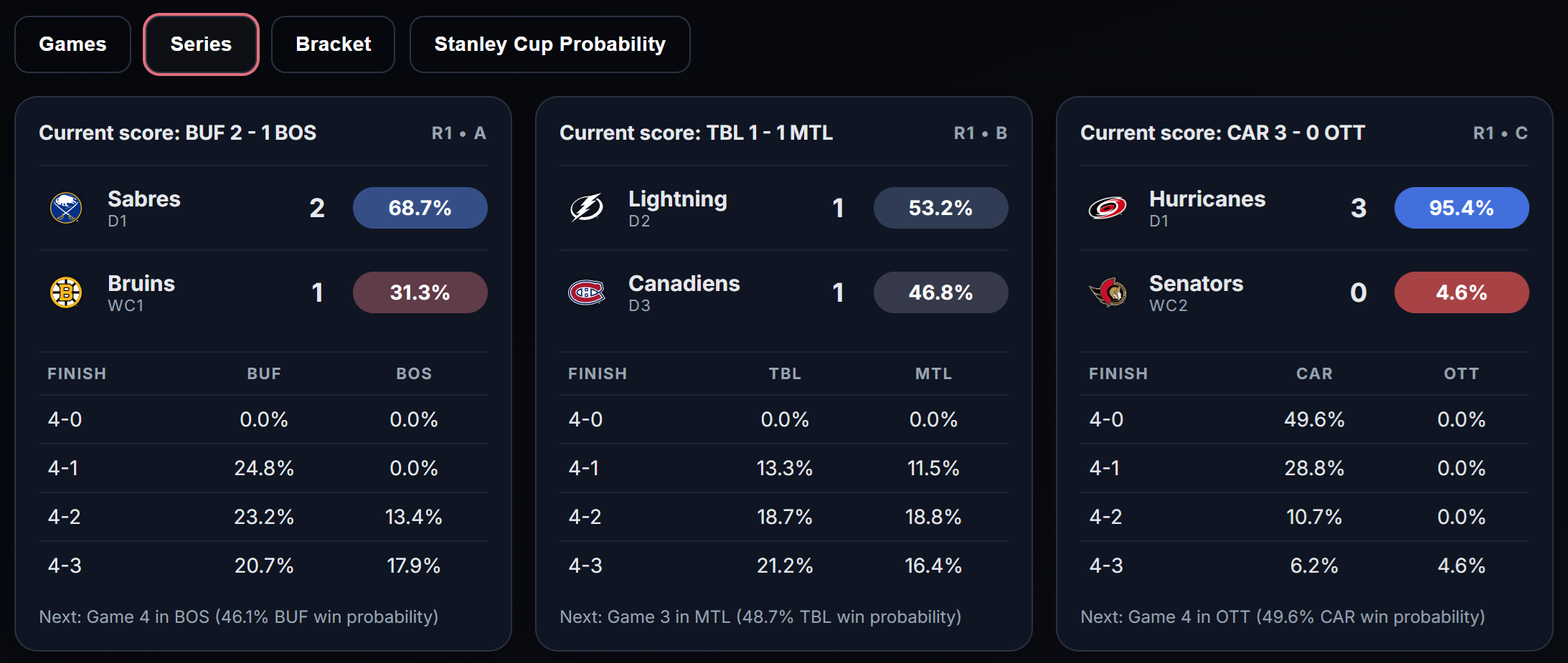
This gives the app a forward-looking layer on top of the descriptive and diagnostic layers. Users can look at individual games, playoff series, bracket paths, and title probabilities in one place.
This article is deliberately not going into the internals of the projection model, but from a product point of view, the projection surfaces are important because they connect the rest of the platform to decision-making and future-looking analysis.
Getting access to the Projections page will require a subscription. This is what will cover the expenses, so even if you're not particularly interested in the game projections, you can help support the site by subscribing.
11. Update and maintenance surfaces
There are also update and admin capabilities in the app. Most users will never interact with them directly, but they matter because the platform is built around frequent refreshes and operational workflows, not static CSVs sitting on a forgotten page.
That is part of what makes the app feel alive.